Wordclouds with ggplot2 and ggrepel
The latest version of ggplot (ggplot 2.0.0) was released in December. This was a pretty big change to ggplot2, including for the first time an official way of extending ggplot. Exciting stuff! One of my favorite extensions to come out since then is ggrepel. It’s the best package for dealing with overlapping labels I’ve used yet. And it got me thinking about making word clouds in ggplot…
Wordclouds get a bit of a bad reputation from the data science crowd. There’s some fair criticism about how it’s difficult to judge which words are larger than others. Also, they’re just a bit uncool. The mullets of data visualisation.
However! A lot of people like them (myself included, I think? but I’m pretty uncool). And the first rule of presenting data is to know your audience. Many audiences will love your word cloud. Secondly, there isn’t really an alternative way of presenting word frequency data, outside of a table. Not a way which is so instantly well understood as a word cloud.
Getting the data
To demonstrate my word clouds I’m going to use Julia Silge’s janeaustenr package, which has data for each of Jane Austen’s novels. Let’s start with Pride and Prejudice, because I’ve watched the BBC adaptation too many times.
The data comes as a 10,721 element character vector, but we can just collapse all this into one element.
library(janeaustenr)
p_and_p <- paste(prideprejudice, collapse = ' ')
Now I’m going to use the tm library and stringr to clean the data and get word frequencies out. For more details about what I’m actually doing here you could read a blog I wrote at my old job! - https://deltadna.com/blog/text-mining-in-r-for-term-frequency/
First word cloud
Now there exists a perfectly good package for making word clouds in R. It’s great, and very easy to use. I’d totally recommend using it every time you need a simple wordcloud. We’ll talk about the advantages of using ggplot in a minute.
library(wordcloud)

wordcloud(word_count$word[1:50], word_count$count[1:50])
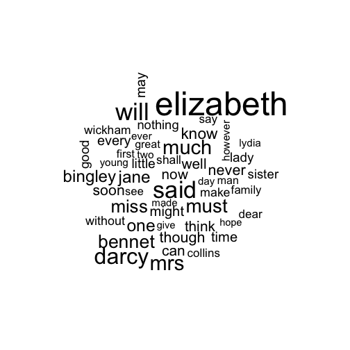
As I said, very easy. Nothing very shocking here; our hero Elizabeth Bennet appears a lot in the text.
First word cloud in ggplot
Here’s how I’ve made a similar word cloud in ggplot. Not very complicated, but certainly not a one-liner like the previous version:
library(ggplot2)
library(ggrepel)

word_count %>%
  slice(1:50) %>%
ggplot +
  aes(x = 1, y = 1, size = count, label = word) +
  geom_text_repel(segment.size = 0, force = 100) +
  scale_size(range = c(2, 15), guide = FALSE) +
  scale_y_continuous(breaks = NULL) +
  scale_x_continuous(breaks = NULL) +
  labs(x = '', y = '') +
  theme_classic()
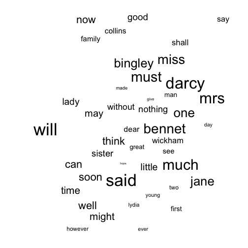
- The geom,
geom_text_repel, comes from theggrepelpackage. It works in a very similar way togeom_textexcept it uses an algorithm to check for the text overlapping and adjusts position of each label to fit. I’ve just set every single word to have an x-y position of (1, 1) and then left it up togeom_text_repelto decide where each word should lie. In the past I’ve given each word a random position between 0 and 1, usingrunif. However, I think this works a little better and gives a more closely packed cloud. - Normally,
geom_text_repeldraws an line from each label to it’s correct position (the idea is that you might want to label points on a graph). To remove the line just setsegment.sizeto zero. - The second parameter,
force, controls how hardgeom_text_repeltries to move the text labels away from their position. The default value is 1, but I’ve set it to 100, to make sure we are really push those words apart and see no overlap. Fiddle with the force value until you get the plotting looking how you like. Note that there’s a random element to the force algorithm, so every time you rerun the code you’ll get different wordcloud. It might be worth saving any clouds that you particularity like. - I’ve set the range of word sizes from 2 to 15. I think this gives a pretty good difference between the smallest and the largest, while keeping everything readable. Note I’ve also removed the legend for size: I think we all get the idea without it.
Why use ggplot then?
Now we’ve got a reasonable looking word cloud in ggplot we’ve got access to all the other features that make ggplot amazing.
For example, we can push the least common words towards the bottom, and colour by word frequency.
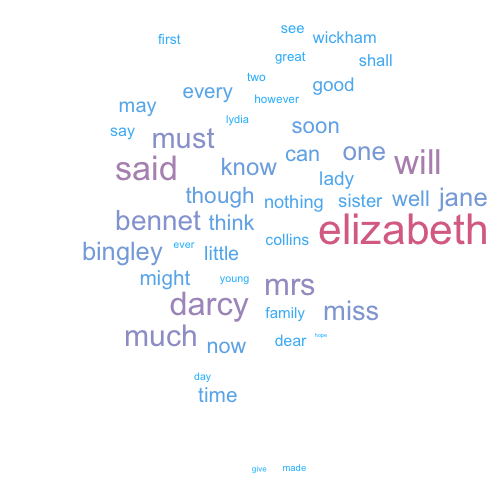
Or we could use colour to highlight the names:
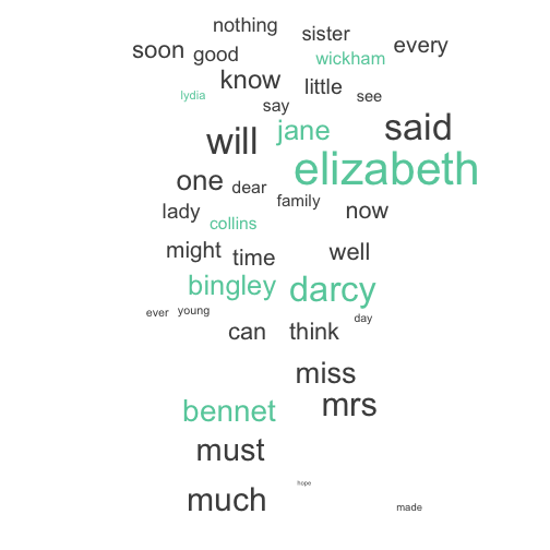
Below is an example of using facet_grid to see the words that are most unique to each of Austen’s books.
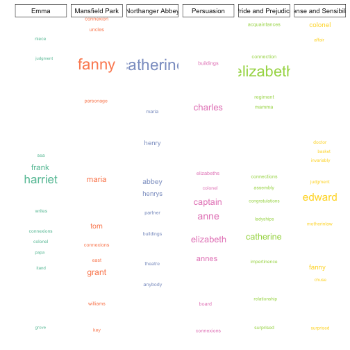
Obviously, this just scratches the surface of what you can do using randomly plotted words. It would be very exiting to see some new takes on the wordcloud by combining ggplot and ggrepel.